Review: Light Room
/I saw Lauren D. Zbarsky several times during the week prior to 'Untitled' Art Space's Light Room. Each time, the curator and co-host of the luminary show was having an americano and beaming with nervousness, stress, and excitement. The poster card for the event had circulated through the community and built an ample amount of anticipation. The card itself — black and white, with a rectangular array of rainbow colours at its centre — evoked a prism, a simple suggestion of what to expect from the upcoming show.
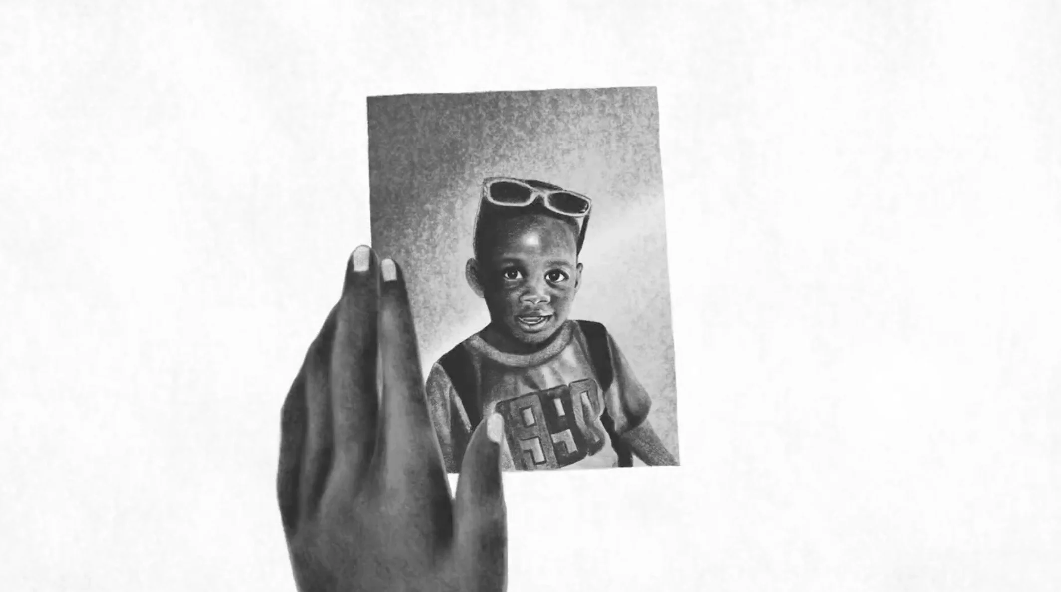
Portrait by Lauren D. Zbarsky. Photo courtesy of the artist.
Light Room took place on a Friday evening, January 29th, and showcased three installation pieces that were designed and curated by Lauren Zbarsky, Alexine McLeod, and Katie So. Ambient soundscapes by Kerry Chambers oscillated from the back of the gallery, contributing to the dreamlike atmosphere of the space. The only light came from the installations themselves.
Visitors entered ‘Untitled’ into a portrayal of Lauren Zbarsky’s bedroom, her most intimate space. Portrait was comprised of a bed on a slightly raised platform, tucked cozily inside a semi-transparent divider and lit from above by a floating cloud of light. At times, people lay down on the bed, absorbing a private sense of comfort in a public sphere. In contrast to the psychedelic colour scheme that dominated the rest of the exhibit, Zbarsky’s installation magically, momentarily placed visitors inside a peaceful bubble. In her other work, Zbarsky often attempts to deliver a personal side of both herself and her subjects. The mirror at the end of the bed achieved a similar effect; when viewed from her bed, the mirror revealed a reflection of not only the onlooker, but of every person who entered the bedroom.
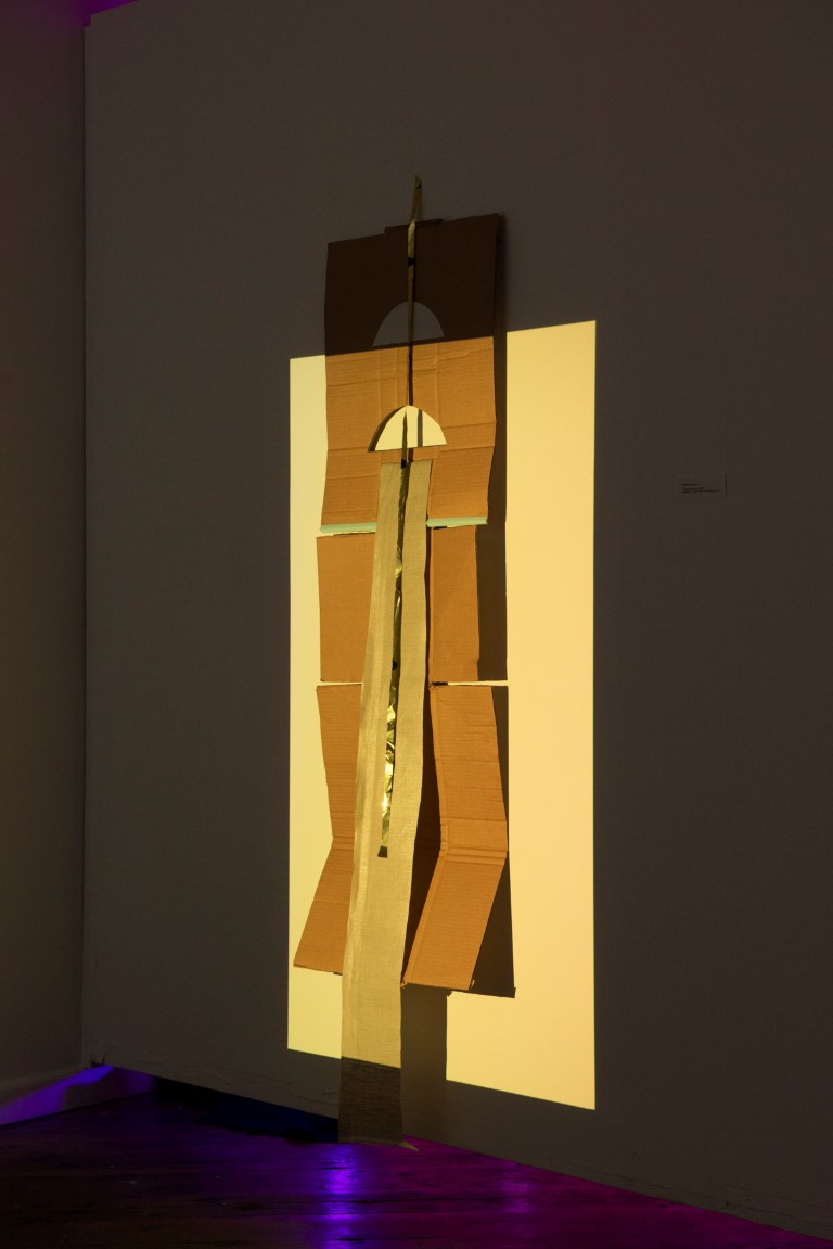
Material Relations by Alexine McLeod. Photo by Lauren D. Zbarsky
In the middle of the art space stood McLeod’s Material Relations, a collage of dangling cardboard, paper, and a single strip of sheet metal. Together, these simple materials formed the shape of a door, backlit by alternating beams of pastel blue, soft yellow, and fluorescent pink. The ensemble reminded me of a cubist painting, with light-flooded cardboard framing the cutout cardboard pieces. Swaying slightly, the metallic sheet glimmered. Material Relations nailed the combination of shapes and colour contrast, and my eyes remained fixated on the piece for minutes. After Portrait’s public intimacy, McLeod’s assembly of simple shapes and captivating colours grounded me, bringing my awareness back to the art space itself.
But the part of the exhibit that wooed me most was illustrator/tattoo artist Katie So’s light projection room, Kauai. Inside, So had painted the walls with tropical leaves and a human heart. The installation appeared complex, though the materials used to assemble it were merely acrylic paint and LED lights. The lights projected alternating hues of bright red, fluorescent pink, and neon blue and purple onto the paintings on the walls. As the purple transformed to blue, the heart gradually disappeared and the leaves came into focus; when a red as potent as blood took over the room, the outline of the heart came into focus again, aggressively, demanding all of the viewer’s attention. The optical illusion seemed to reflect greater truths about perception itself: how our minds and eyes so often become fixated on certain ideas and thoughts, or how easily we can become blindsided from what is present at the periphery.
Kauai by Katie So. Photo by Lauren D. Zbarsky
In some exceptional moments, the exuberant, psychedelic rays from So’s projection room seeped through the spaces between the wall, the ceiling, and the floor and onto McLeod’s installation, adding to the rotation of colours. Barely a step away, observers could watch the interplay between colours and borders from Zbarsky’s bed. And those same observers, when seen from the other side of the divider, likewise appeared to participate in this dance of shades and visibility, adding a third dimension of interaction.
At first impression, the limiting size and shape of ‘Untitled’ was inhibiting. Practically speaking, it affected how long I chose to stay; more importantly, however, these limitations ensured that I moved through the exhibit in a linear, straightforward fashion. The result was a sort of ecstatic, dashing experience that left me buzzing.
Polychromatic, at once futuristic and nostalgic, Light Room was an unexpectedly intimate affair. Zbarsky, So, and McLeod impressed with creativity and craftsmanship that extends beyond their usual realm of practice.
For more about Light Room and ‘Untitled’ Art Space, visit laurendzbarsky.com or untitledartspace.ca.


